
Villa Baronessa: Architecture. Colour. Atmosphere.
On the edge of the South Tyrolean wine village Kaltern, yet close to its old market square, there is an ensemble of two houses in a lush Mediterranean garden, emanating a very special aura.
This is an article from our archive. It was published in March 2019, so some details may no longer be up to date.
Like two huge sculptures, the buildings linger contemplatively in the silence of the surrounding nature. The Villa Baronessa and the smaller Villa Baronessina combine apparently contrasting concepts most harmoniously: historical and contemporary, South Tyrol and Japan, alpine and Mediterranean, architectural independence and cultural context.
Like an architectural oxymoron, they highlight their very own essence through the blend of opposing elements. The Baronessa ensemble is the result of a fruitful interdisciplinary cooperation: Kaltern architect Walter Angonese and artist Manfred Alois Mayr from Vinschgau have sensitively traced the essence and history of the property and anchored it gently yet unmistakably in the present. The duo has masterfully succeeded in balancing sophisticated architecture and a relaxed holiday feeling. A place for the soul and the senses.
Two souls, alas!
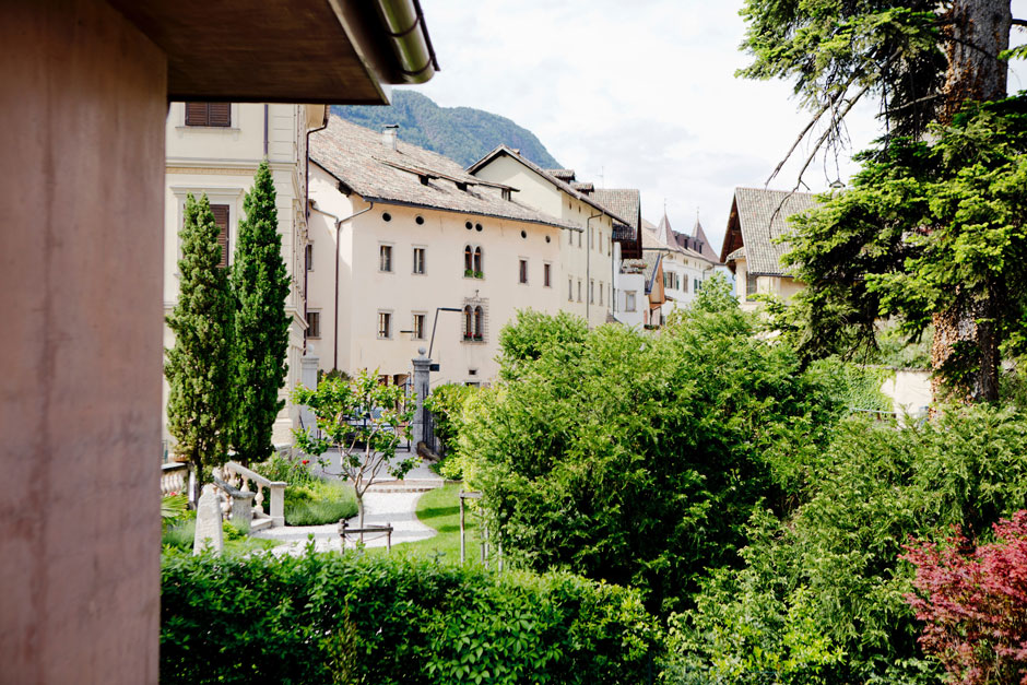
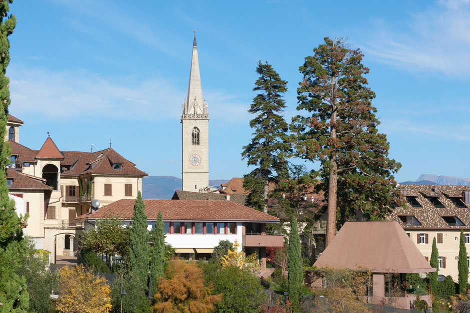
If you exit the Brenner Motorway at Tramin, you will already be great deal closer to the South. The country road winds its way uphill between apple orchards and vineyards, while Lake Kaltern glistens quietly and placidly on your right-hand side. Further up you reach the picturesque town of Kaltern, with its lively market square and houses in the Überetscher architectural style (1550 — 1600). Bay windows, sandstone arcades, loggias, open staircases and closed courtyards are recognisable elements of this local tradition. And yet these buildings still allow you to sense the influence of central Italy – the legacy of the Tuscan princess Claudia de’ Medici.
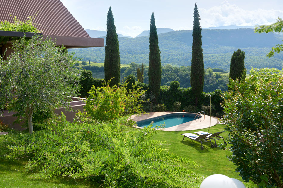
Two souls, alas! house within Kaltern’s breast. The wine village and its surroundings combine apparent opposites into a unique symbiosis and atmosphere. German and Italian culture. Local tradition and a feel for contemporary architecture. The rugged mountain scenery of the Dolomites and the gorgeous Mediterranean wine landscape. Kaltern’s air already has the “mild and gentle” quality described by Goethe in his “Italian Journey”. Palms, passion flowers, cypresses and lemon trees stand as harbingers of the southern flair in front of each façade and in the gardens. All around, the peaks of the Dolomites and those surrounding the Mendelpass reach over 2,000 metres into the sky.
Two Baronesses and a lottery win
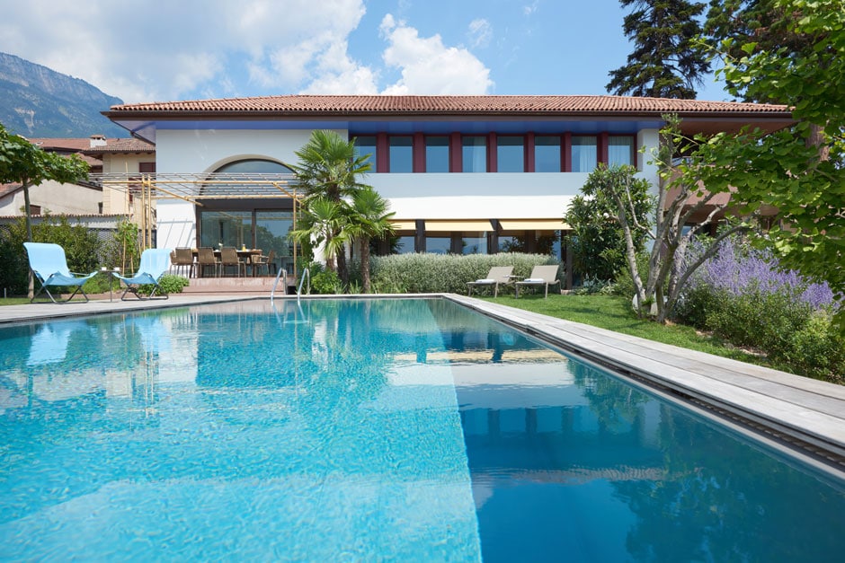
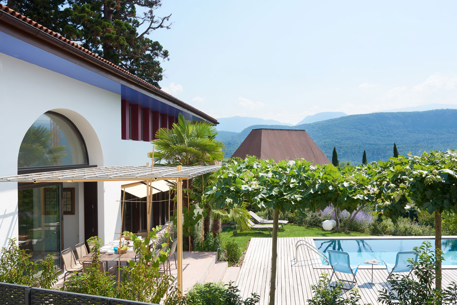
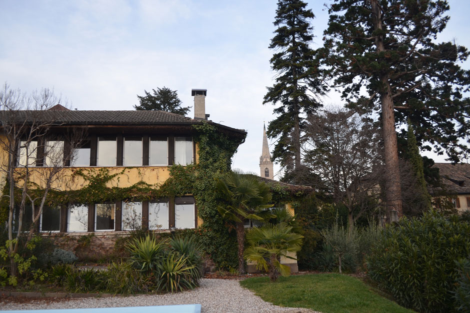
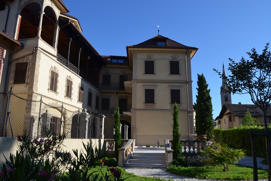
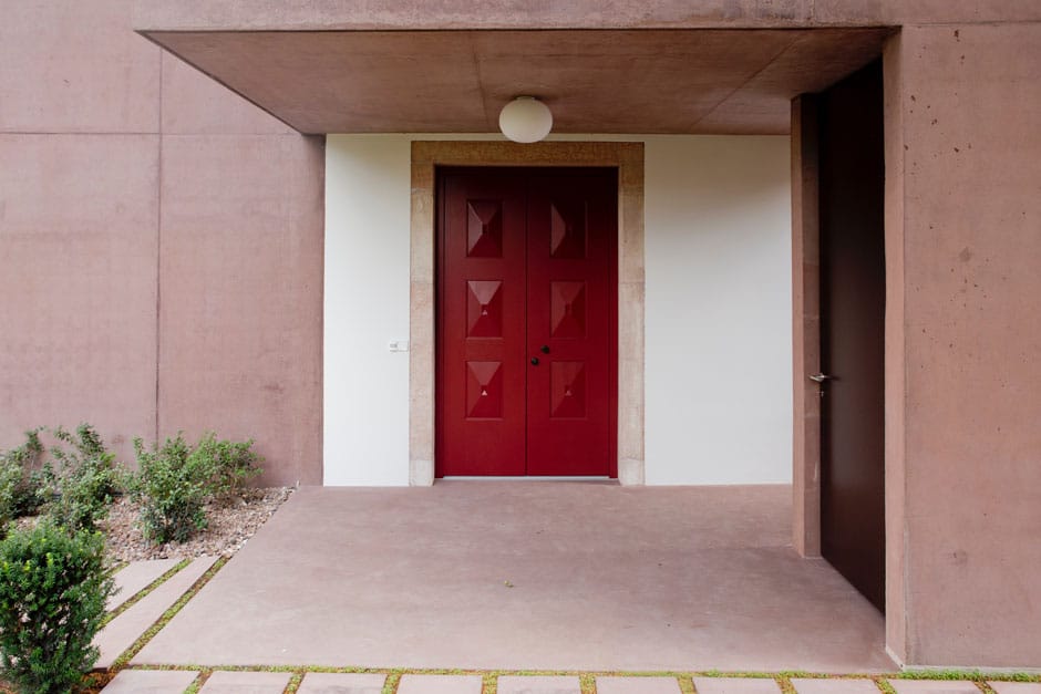
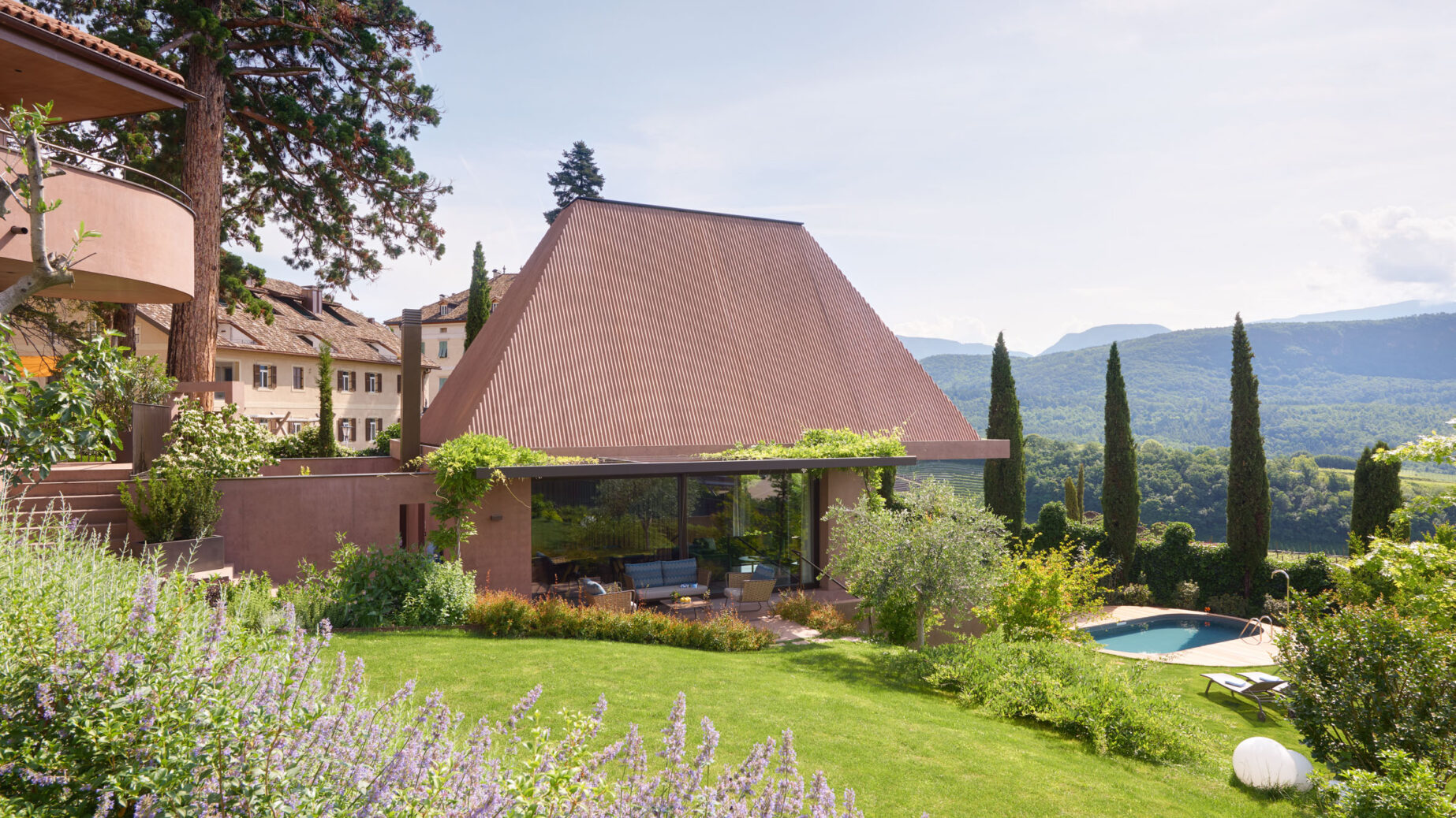
The Villa Baronessa, built by Walter Pinzer in the 1950s, was the garden and tea house of the neighbouring palace of the Baronesses Weihrauch di Pauli and marked the southern end of the extensive private park of the splendid estate.
From here the view wanders far into the landscape and here Claudia and Reinhart Volgger, together with their son Florian, have fulfilled their dream of a very special place where to welcome friends and guests: “When the garden house in the park of the Palais Weihrauch Baron Di Pauli was surprisingly up for sale in 2012, I felt that this was a unique opportunity, almost a lottery win. I was fully convinced of the location and potential and seized the opportunity. We then commissioned the architect Walter Angonese with the planning because he had already realised several buildings — many of them together with the artist Manfred Alois Mayr — which we were enthusiastic about. In addition, Professor Angonese had won the planning competition for the construction of a library on the neighbouring property and we were convinced that he would create a harmonious ensemble,” says Reinhart Volgger.
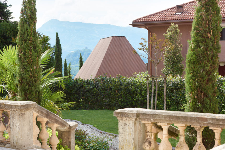
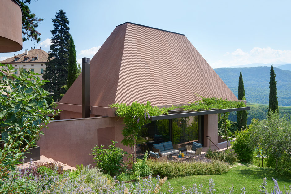
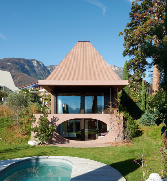
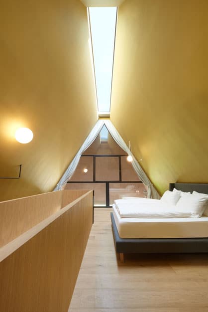
Walter Angonese extended Pinzers building to the east by a modern annex and “led” the Baronessa harmoniously into the 21st century. Adjacent to it, a pavilion-like structure was built, once again taking up the idea of the tea house, while at the same time giving a contemporary slant on typical local elements: the Villa Baronessina with its striking hipped roof.
Both houses are connected underground, but at the same time enjoy their absolute independence and privacy.
Mood and vibration
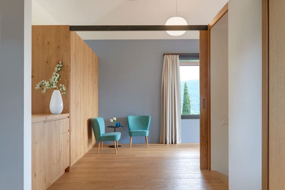
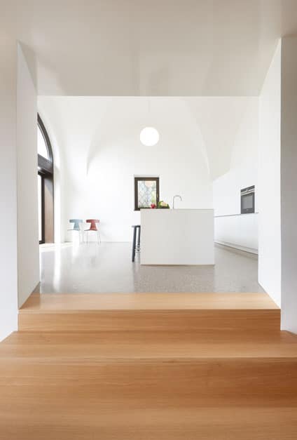
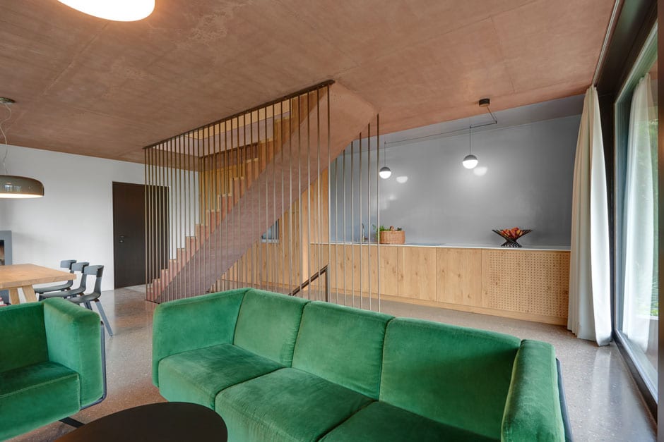
Both houses spring surprises at every step, with unexpected persepctives and evocative sensory effects. The symbiotic interplay of architecture, colour and visual and tactile surface textures creates a subtle yet clearly defined tension between contemplative atmosphere and communicative resonance. The clear colour concept creates an almost meditative atmosphere and the light and spaciousness of the rooms is in constant dialogue with the sky and the landscape, the architecture framing a multi-faceted show staged by nature.
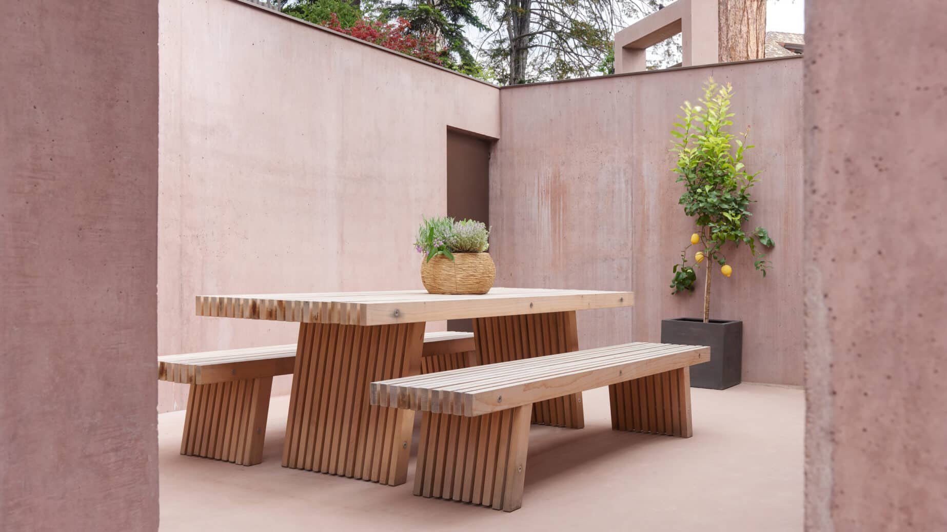
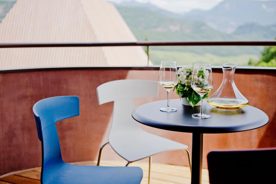
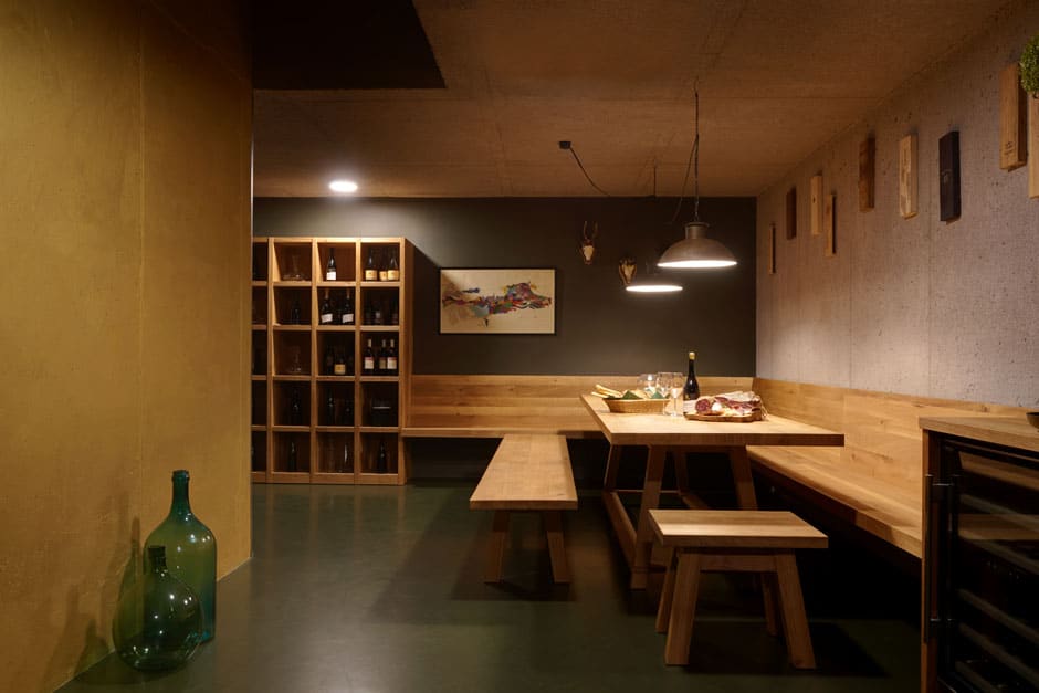
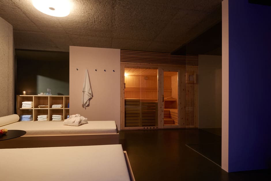
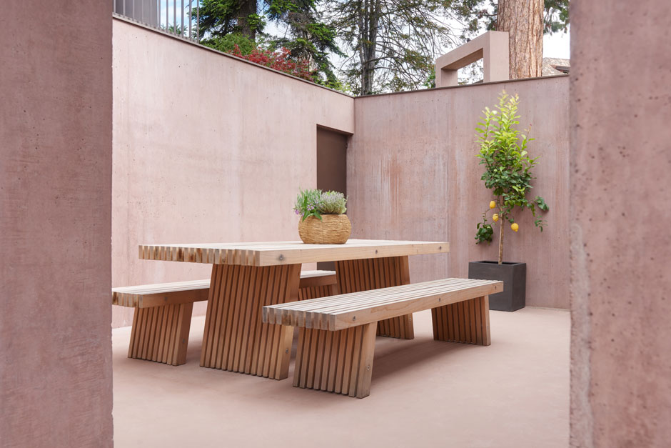
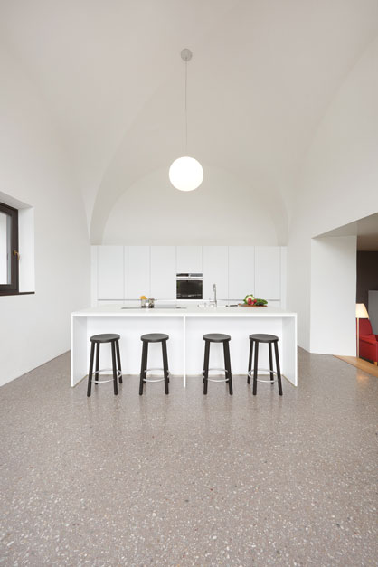
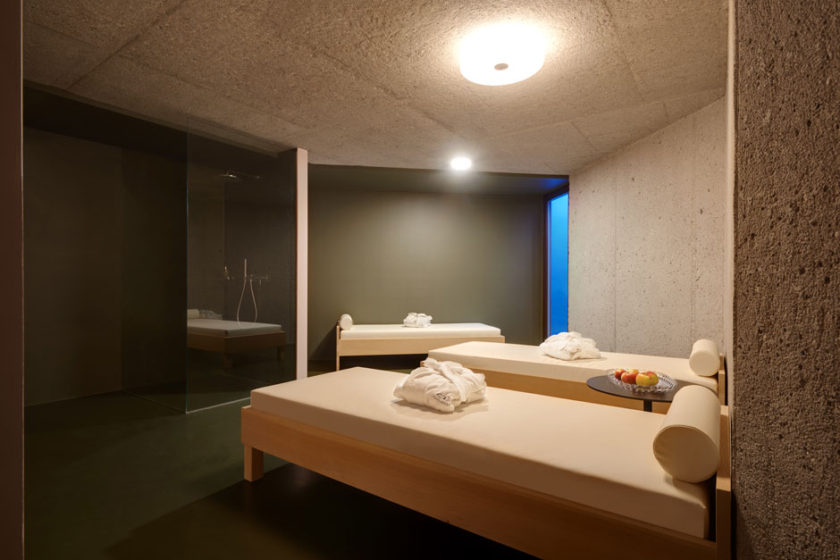
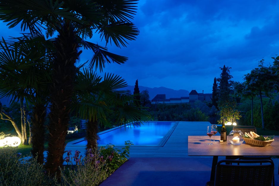
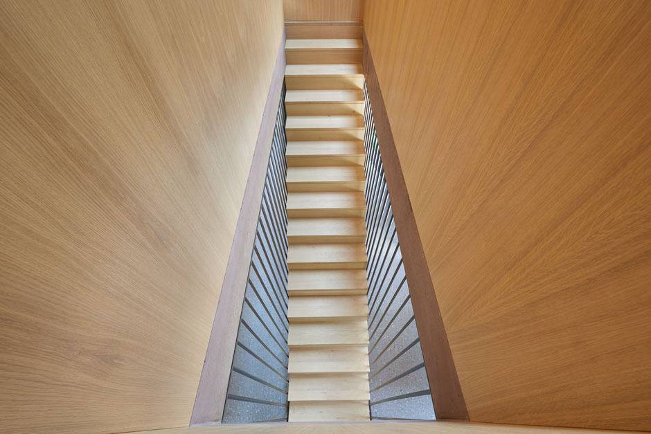
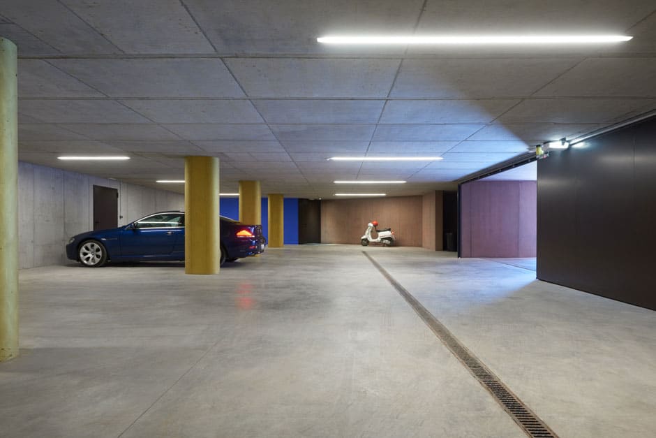
The patio acts as chromatic and architectural link between the Villa Baronessa and its “little sister” and becomes a communicative space, very much in Mediterranean style. The basement of both houses has an impressive energy: the wine cellar, the sauna, the underground parking and even the staircase become contemplative “holy” rooms and awaken a world of sensory perception.
The construction of the idea
The Kaltern based architect Walter Angonese made his mark in particular with his wine architecture, which he realised for the Josef Hofstätter winery in Tramin and for the Manincor winery in Kaltern. His projects also include architectural adaptations of important historical buildings, such as Castle Tyrol and the Kufstein fortress. The leitmotifs are always the site- and culture-related planning process and the continuation of the existing building. “His” library in Kaltern, which directly borders the Villa Baronessa property, was opened in 2018. Angonese is a regular professor at the Accademia di Architettura of the Università della Svizzera italiana in Mendrisio.
Mr. Angonese, your approach is strongly influenced by the concept of “building on”, in the sense of building on what already “is”. In today’s Villa Baronessa/Baronessina ensemble, the boundaries between Walter Pinzer’s old structure and Walter Angonese’s new architecture are fluid. Is “building on” what “is” a greater challenge than creating something new?
What I mean by “building on” is not just a matter of building on the property itself, but on the context, on the place. Elements and themes are taken up, interpreted and manipulated. Associations emerge from this process, such as those of a Japanese teahouse in the case of the outbuilding – the Villa Baronessina.
The roof was important to us as an element of continuity, but with a concrete building that was metaphorically “inserted” under the Pinzer building, you couldn’t “create” a monk’s or nun’s roof; we re-interpreted it and from this idea the corrugated concrete roof of the annex emerged. The rest is a reaction to topography, coping with spatial planning constraints, etc.
Creation has become a bit of a dialectical legitimisation vis-à-vis “building on”. That’s not enough for me. I don’t like the contemporary “Klimahaus” (climate house) style boxes. What’s more, we had won a competition to build a new library to the left of the Baronessa, and we had planned to build it before we had even started work on the Baronessa, but then that project seemed to have been shot down – at least for a while – and we completed the Baronessa beforehand. Nevertheless, the Baronessa is also in a dialogue with our library: the “southern front” of the Kaltern marketplace, where typological and formal relationships emerge and are interwoven.
What conditioned us in the sense of “building on” the existing? Scale, appropriateness, the completion of the local structure, the paths within the house. The landscape. When it came to the teahouse also the framing of the landscape.
How do you approach the historical substance of a building? And how does architecture remain authentic when historic buildings are redeveloped in the present?
We always approach historic buildings with respect. I myself have developed a method that might be best described as “monument conservation without monument conservationists”. The existing building always has a value that needs to be understood and interpreted. But not neurotically so – with respect and reverence, rather than unhelpful mental blocks. I have a similar strategy with all existing buildings; from time to time the monument protection services get in the way, from which I expect an equal dispute and no power battles. I’m happy to respond to such disputes, but not when they come “from on high”.
We feel that we succeeded in preserving Walter Pinzer’s authentic style, and that we even took it a little bit further by applying the colours of Manfred Alois Mayr. The original yellow was not quite philologically accurate: Pinzer employed a yellowish colouring at the Weihrauch di Pauli residence, which the investigations in the course of the restoration of the residence revealed to be quite arbitrary. Today the building has regained its original character. Yellow would have been a mistake, and beige in the context of the new library would have been incoherent, since the new library replaced a run-down barn building in yellow tones. And yes, we also extended the building. In this case, the most appropriate strategy was to simply extend the hipped roof and add the extension underneath; it would have been wrong, in this case, to connect a completely new structure.
The Baronessa Ensemble was a joint project with artist Manfred Alois Mayr. Colour became an architectural task; architecture an unfolding space for strongly resonating colours. How does this interdisciplinary creative process succeed, in which architecture and art merge symbiotically without losing their independence?
We have a great deal of mutual trust and have been working together for a long time. Often we start out on a common path and then our two disciplines divide, but sometimes Manfred only needs to make very selective contributions. The pergola was one of those – we had planned a pergola so that the outside area of the kitchen could be used too. For the rest the house, Manfred was simply given a colour outline. And the result is what you see today. Ultimately, I believe it is our mutual trust.
Manfred Alois Mayr first “senses” a place. What comes first with Walter Angonese: the head or the gut?
My gut feeling. My project methodology is “the construction of the idea”, which I also teach in the context of my university courses. From intuition to cultural and tectonic reflection, from declining architectural tools and approaches to the idea. Which you should never abandon. At the beginning, however, I always operate more intuitively than rationally. But, where are the boundaries for someone who doesn’t like boundaries?
You dubbed the Villa Baronessina the “teahouse”.
The Japanese teahouse is a personal association. Whether the Baronessina is perceived as such by others is not important to me. A teahouse is both introverted and extroverted, plays with gardens and spatial perceptions (for example Katsura, Roynai etc.). But a teahouse is not a residential building. In this respect it remains a personal association and object of my intuition.
What role does the landscape play for the Baronessa Ensemble?
The interior living landscape and the landscape in the sense of the views and the spatial perception of the immediate landscape are always important themes for us. This is one of the reasons why we have created a Mediterranean garden for our friend and landscape designer Roland Dellagiacoma. He knew how to create a landscape as well as a climatic buffer between the sealed surface of the parking level and the expanse of the landscape. With a lot of variety, but inspired by the South. We are just at the cusp of the South, as Goethe recognised.
Alchemist of colour
The artist Manfred Alois Mayr enters into resonance with the essence of a place. Like an alchemist, he transforms the identity of a place into colour. His chromatic concepts — in the Manincor winery, at the University of Bolzano, in the Museum Vorarlberg, to name but a few — have a powerful effect on the viewer. The history, stories and the cultural context of the place of his interventions guide M.A. Mayr in his choice of pigments and techniques, and the emphasis is not on the artistic act itself but on the identity of a place that can be experienced through colour.
Mr. Mayr, colour is anything but a design or decorative element for you. Colour is instead an experiential medium in the tension between art and everyday life in your projects. How do you use colour?
Colour has become a central theme for me in general. In architecture, colour is not decorative for me, but rather a physical presence – an effect on the occupant of a room. I don’t want to place the observer in front of but “within” colour. In that I include everything concerning the history of a colour and its “materiality”: the extraction of various pigments and their origin, their relationship to a particular place or tradition. The attraction of a place lies not only in its individual smells and noises, but also in its different colours.
I quite like to compare it to music, where, despite playing the identical note, different instruments can be distinguished from each other. A “C” on the trombone sounds different to a “C” on the flute or violin. So the timbre of a piano is different from that of a string or wind instrument. Then there is also the colour rhythm and the speed of a colour – here too the comparison to the tempo and pauses in music is pretty clear. “Adagio” (slow and calm) or “vivace ma non troppo” (lively but not too much) or “moderato” (moderate).
The “volume” of a colour is also important. Matt ultramarine blue behaves differently both spatially and in terms of its aura than high-gloss ultramarine. Light and shadow, as well as a reflecting or light-absorbent surfaces, are essential factors for the efficiency of a colour.
You describe yourself as a “senser” of places. How did you “sense” and perceive the property of Villa Baronessa at the beginning of the project? What fascinated you?
The first thing that impressed me was the location and the combination of the two structures – i.e. the interplay of the old and new structures. They interlink the past with the present.
As always, when entering a building site, my first impressions arise in the form of questions: What is the architectural language? How do I respond to it? What is the function of the building? Where does it require emphasis or refinement? Where is the whole “orchestra” required, where is it a solo piece? Where are there pauses?
I walk through the building site several times like a water-diviner and wait to see where the architecture creates the impulse in me to make a colour intervention.
Finding the balance between the place, the space, the wall (including the physical properties of the wall) and the complete structure always requires a very specific colour tone. The great challenge for Villa Baronessa was to pinpoint and refine that colour tone until it really started to resonate.
How does the “message” of a place manifest itself to you?
Every place or non-place has a soul for me and every constructive engagement with it requires its own unique approach or treatment. Engaging with and absorbing the foreign environment is a way to find myself in that place – in the opposite way friction, inspiration and ideas take me out of myself. The task I set myself each time is to create a “place within a place”.
What are the colours/pigments you have used in Villa Baronessa and Villa Baronessina?
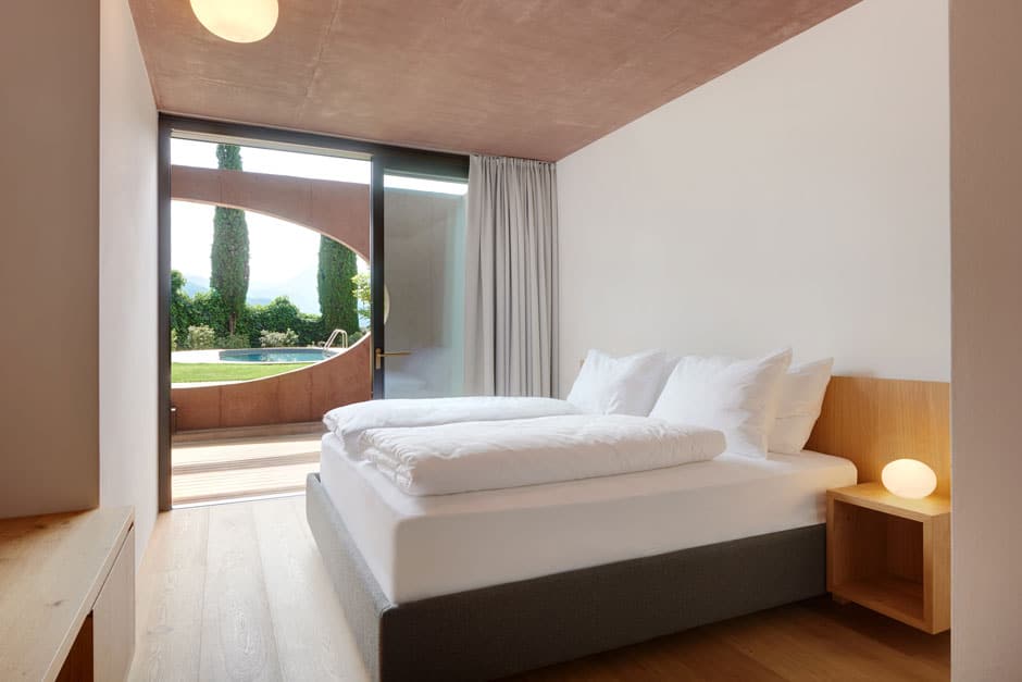
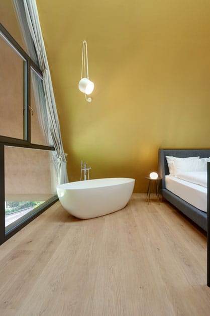
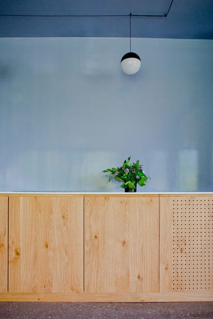
The two main colours that give Villa Baronessa its personal character are lime white, ultramarine blue and oxide red. They partially extend from the outside to the inside and thus – to compare them to natural colours – enhance the pale lilac blue and dull lemon yellow of the interiors. In Villa Baronessina, on the other hand, gold dominates the sleeping area on the upper floor. The light falling from above lends the tent-shaped and unusual room a special warmth and atmosphere.
The primary challenge at Villa Baronessa was to accentuate the architecture to the utmost degree through colour – I was able to achieve this by combining the above-mentioned colours with “non-colours”, i.e. the inherent colours of the materials used, such that the colour is sensed but not “seen”. In the villa’s interior, for example, it appears as natural as a window to let in the light.
The essence of Villa Baronessa and Villa Baronessina is revealed through mood, colour oscillation and sensory experience. How do the two houses affect you today? Can you put the essence of Villa Baronessa and Villa Baronessina into words?
I don’t want to express the essence of Villa Baronessa and Baronessina. Because colour and architecture can do what language cannot do, and language can do what colour or architecture cannot do. For me it is a matter of really “living and breathing” a space: immersing yourself in the rooms in order to feel their essence and mood, to experience them and let them have an effect on you. Architecture and colour are a way of life – the mood between the occupant and the space is the culture …
Text: Britta Krämer, March 2019
Overview: Here you can find all our HomeStories at a glance! If you want to stay up to date, you can opt-in for our HomeStory-Newsletter here.
The house


0 Comments